JELLY BEAN
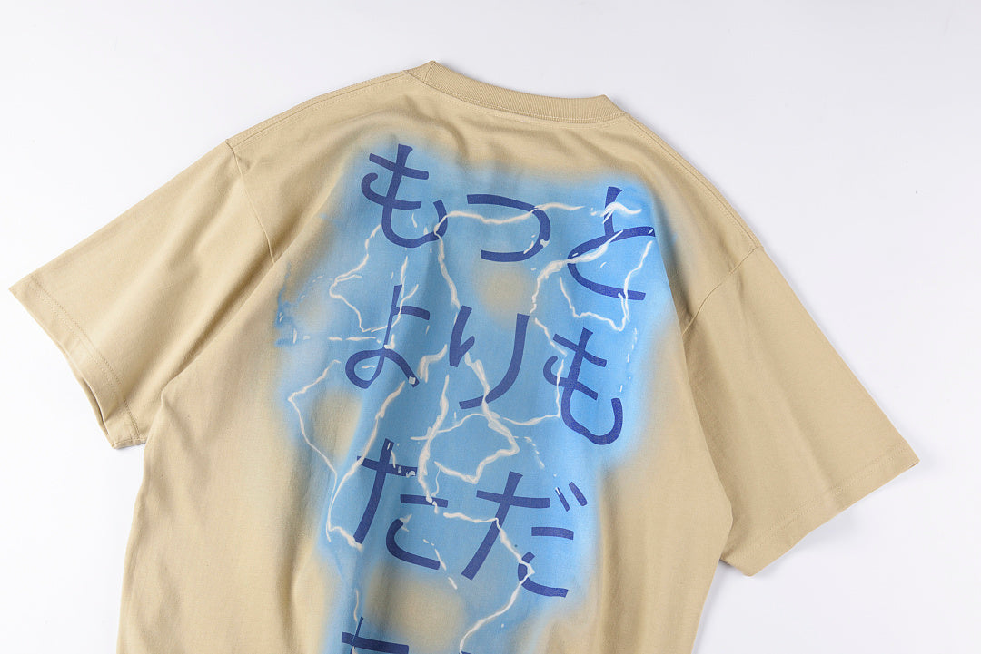
Jellybean Electric Anime Runner Graphic T-Shirt - Beige
Jellybean Electric Anime Runner Graphic T-Shirt - Beige
Couldn't load pickup availability
JELLY BEAN American Vintage Quirky Print Unisex Tee in Cream.
Charcoal and Cream are the same brand making two different arguments about the same print. Charcoal argued through contrast: the deep ground made the print arrive louder, made the candy visible in the way that things are most visible when they are placed against what they are not. Cream makes a different argument. Cream does not create contrast with the print — Cream joins it. The ground and the print in Cream are in the same temperature range, the same warmth register, the same part of the palette that the eye reads as belonging together. This is not absence of design thinking. This is a different design thinking: the thinking that says the print does not need to arrive loud because the print is already good enough to be encountered quietly, and a quiet encounter with a good print is more lasting than a loud one. Vanilla is the original jelly bean. Before the two hundred and fifty flavors that Jelly Belly eventually developed, before the novelty flavors that were intentionally unpleasant, before the flavors that were jokes — there was vanilla, which is not a joke and has never been a joke and is instead the flavor that everything else is implicitly measured against when it arrives and announces itself as something other than vanilla. Cream is the color of vanilla. It is also the color that white becomes after it has been somewhere for a while — after the sun has touched it in the specific way that sun touches white fabric over time, after it has been through enough washes to lose the brightness that new things have and gain the warmth that washed things have, after time has done to it what time does to everything it touches without destroying it: made it slightly more itself, slightly less perfect, significantly more interesting. The vintage print on Cream looks like it has always been there. Not because it was printed to look old — but because Cream is the color that things settle into when they have found their correct relationship with time. The thrift store Tee that you find at the back of the rack, the one that is the right size and the right print and already the right temperature, the one where you cannot tell exactly how many years it has been there but you can tell it has been the right number of years — its ground color is not white. It is Cream. JELLY BEAN in Cream is the brand wearing the color of its own product: the vanilla jelly bean, the original, the one that everything else is measured against. Not loud. Not trying to be louder than it is. The print and the ground are in the same conversation. You can stay in that conversation as long as you want. It does not end.
Key Details
- 🥛🍬 Cream — not the canvas, the candy itself: vanilla, the original, the one everything else is measured against:
- Charcoal: made the candy loud through contrast — placed against what it is not. Cream: joins the print, not contrasts it — same temperature range, same warmth register, the eye reads them as belonging together
- Vanilla jelly bean: the original flavor, before the 250 Jelly Belly flavors, before novelty, before jokes — vanilla is not a joke and has never been a joke; it is the flavor everything else is implicitly measured against when it announces itself as something other than vanilla
- Cream is the color of vanilla. JELLY BEAN in Cream is the brand wearing the color of its own product.
- 🥛⏳ The color white becomes after it has been somewhere for a while — time doing what it does without destroying:
- White after sun, after enough washes to lose new-brightness and gain wash-warmth — time doing to it what time does to everything it touches without destroying: made slightly more itself, slightly less perfect, significantly more interesting
- The vintage print on Cream looks like it has always been there — not printed to look old, but Cream is the color things settle into when they have found their correct relationship with time
- The thrift store Tee at the back of the rack: right size, right print, already right temperature, right number of years — its ground color is not white. It is Cream.
- 🥛💬 The print and the ground in the same conversation — quiet encounter, more lasting than a loud one:
- Different design thinking: the print does not need to arrive loud because it is already good enough to be encountered quietly — a quiet encounter with a good print is more lasting than a loud one
- Not trying to be louder than it is. The print and the ground in the same conversation.
- You can stay in that conversation as long as you want. It does not end.
- 📏 Unisex — Sizes S–XL — Pure Cotton — $59.00
Share